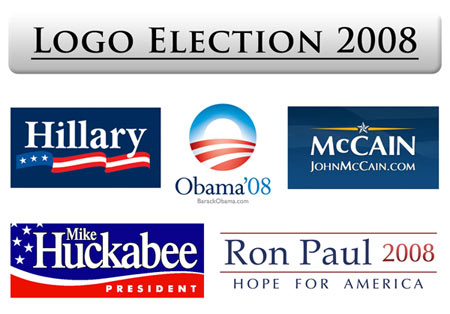
Greetings fellow Americans, I’m sure you’re all aware by now of the exciting presidential race going on. All the candidates are touting their new ideas to “change” America, some of the key issues are the war in Iraq, the economy, immigration reform, and more, but they’re all missing the biggest issue- Who’s the president for Design? who’s going to support the artists of America? the backbone of the Economy. Here are some questions for you Mr. or Mrs. Presidential hopeful: what are you doing to ensure our safety from Comic Sans terrorist, What is your policy on Helvetica, and what’s your stance on Kerning, etc. Looking at these logo’s two stand out for me- Obama and McCain seem to be the clear choice for best designs, the other’s look dated and uninspiring. But that’s just my in-depth political analysis. Take a look at these yourselves and you decide- who really is the president for change and a new hope for America.
Feb 18
February 18th, 2008 at 1:12 pm
Obama’s logo is for sure my favorite… new sun rising over the land, all while reinforcing the letter “O” of his name. Good stuff. The others are quite uninspired. Interesting how McCain is the only one using a sans serif font.
btw – the only antidote for the terror of comic sans is the strength of Gotham Black 😉